Case study · Barbershop · Alderwick & Hawthorn Quay, West London
A barbershop, not a salon.
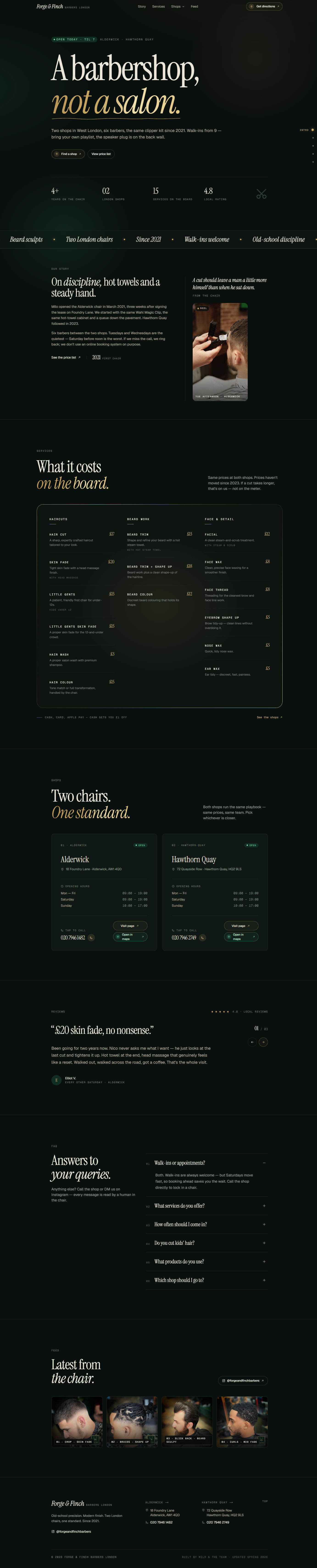
Forge & Finch Barbers needed a website that matched the feeling of the shop: sharp, confident, old-school in discipline but modern in finish. No soft salon language, no overcomplicated booking platform, no generic template. The goal was to create a site that showed the barbershop’s identity clearly: two London shops, six barbers, walk-ins welcome, transparent pricing and a strong local presence. Built in five days, launched live, and delivered for under £500.
- first paint
- 0.9s
- Lighthouse score
- 99
- built and shipped
- 5 d
- all-in cost
- £499
The brief
Forge & Finch Barbers is a two-location barbershop with shops in Alderwick and Hawthorn Quay. The brand is built around proper cuts, skin fades, beard work, hot towels and a no-nonsense chair-side experience. They needed a website that felt editorial, masculine and direct, while still being practical for customers. The site had to show services, prices, opening hours, shop addresses, reviews and contact options without turning into a heavy booking platform. The focus was simple: help people choose a shop, check the price list and walk in.
Approach
How it was built.
- 01
Editorial design direction The site was designed with large typography, strong contrast, bold spacing and a confident layout. The goal was to make the brand feel sharper than a standard local barbershop website.
- 02
Two-shop structure The website clearly separates the Alderwick and Hawthorn Quay locations, with addresses, opening hours, phone numbers and map links so visitors can quickly choose the closest shop.
- 03
Service-led pricing section The price list was built around real customer intent: haircuts, skin fades, kids’ cuts, beard work, facial treatments, waxing and detail services. Customers can check prices fast without digging through pages.
- 04
Brand copywriting The copy was written to feel direct and memorable: old-school precision, modern finish, walk-ins welcome, and no unnecessary salon-style wording. It gives the shop a clear personality.
- 05
No heavy booking system Instead of forcing customers through an external platform, the site keeps the journey simple: call the shop, check the location, view services and walk in. This keeps the experience closer to how the business actually works.
- 06
Performance-first build The site was built to feel fast, clean and smooth on mobile. No unnecessary bloat, no heavy third-party systems, and a clear structure focused on local conversion.
Outcome
Forge & Finch Barbers launched with a sharp, mobile-first website that feels closer to an editorial brand page than a basic local shop template. The new site gives customers everything they need quickly: services, prices, reviews, opening hours, locations and direct contact options. It helps the business look more established online while keeping the same no-nonsense personality customers get in the chair.
- Astro
- Tailwind CSS
- Sharp
- Web3Forms
- Netlify hosting
Other case studies
Want one like this?
From £499. Live in seven days. One builder, direct contact, all yours.
Get a quote